
Kembara
Creative Direction | Art Direction | Graphic Design | Cinematography | Photography
Logo
The problem.Independent food trucks live in a category that has visually
collapsed into two clichés — neon-graffiti "street food" and beige "artisan"
minimalism — leaving a chef with a genuinely distinct culinary point of view
no shelf on which to place it. Kembara wanted to seperate and elevate.
The idea. Treat Kembara like a small editorial magazine that happens to
serve dinner: pair the disciplined typography and composition of Nordic
design publishing with the color, pattern, and hand of the Nusantara street
tradition, and let the truck itself be the largest page in the book.
The payoff. A brand system that reads at forty feet on a truck side and
four inches on a phone, gives the operator a full opening-day toolkit
(wrap, menu, packaging, apparel, social, teaser film), and gives the food
writers at Eater SF a story they already know how to tell.
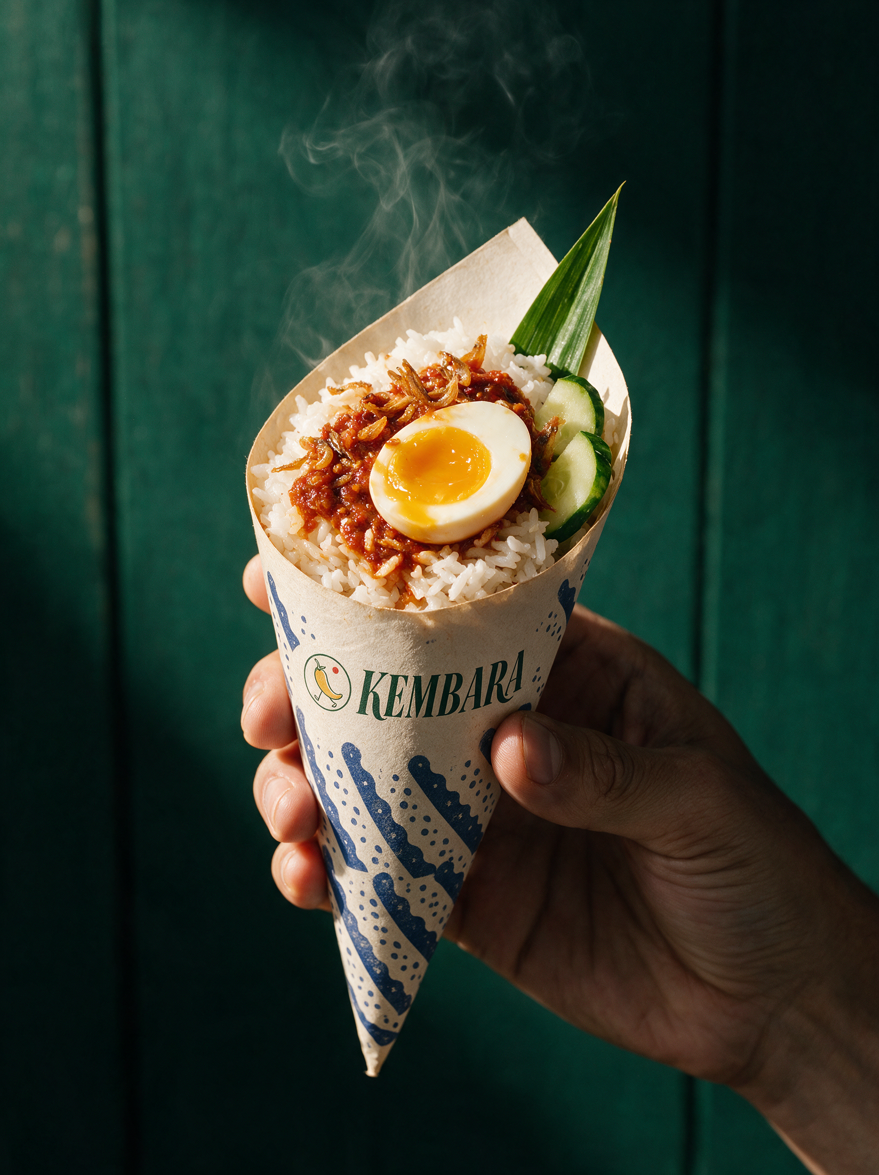
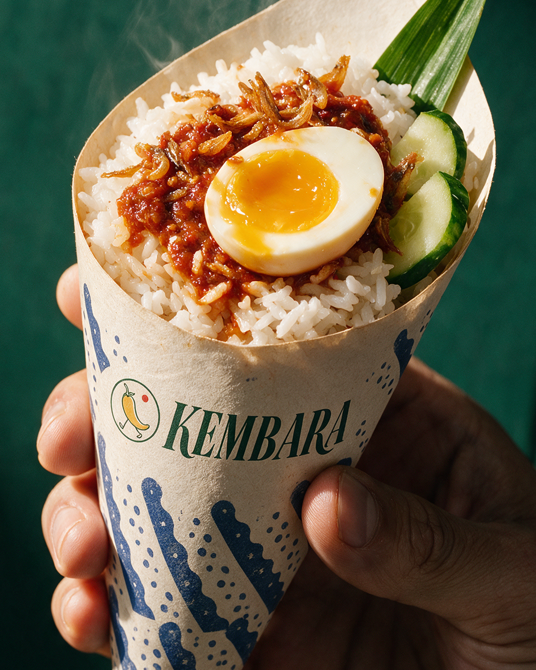
Package Design
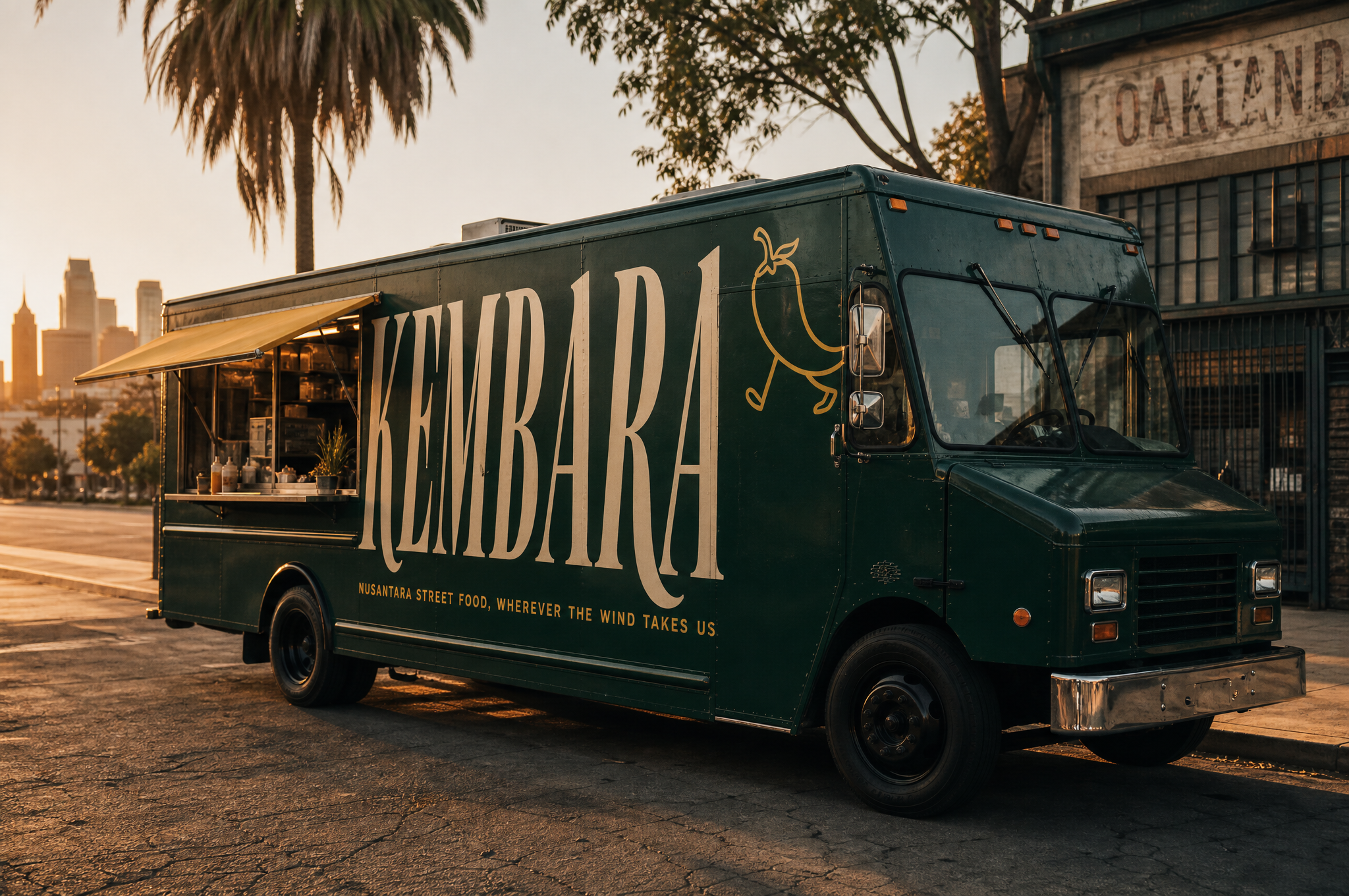
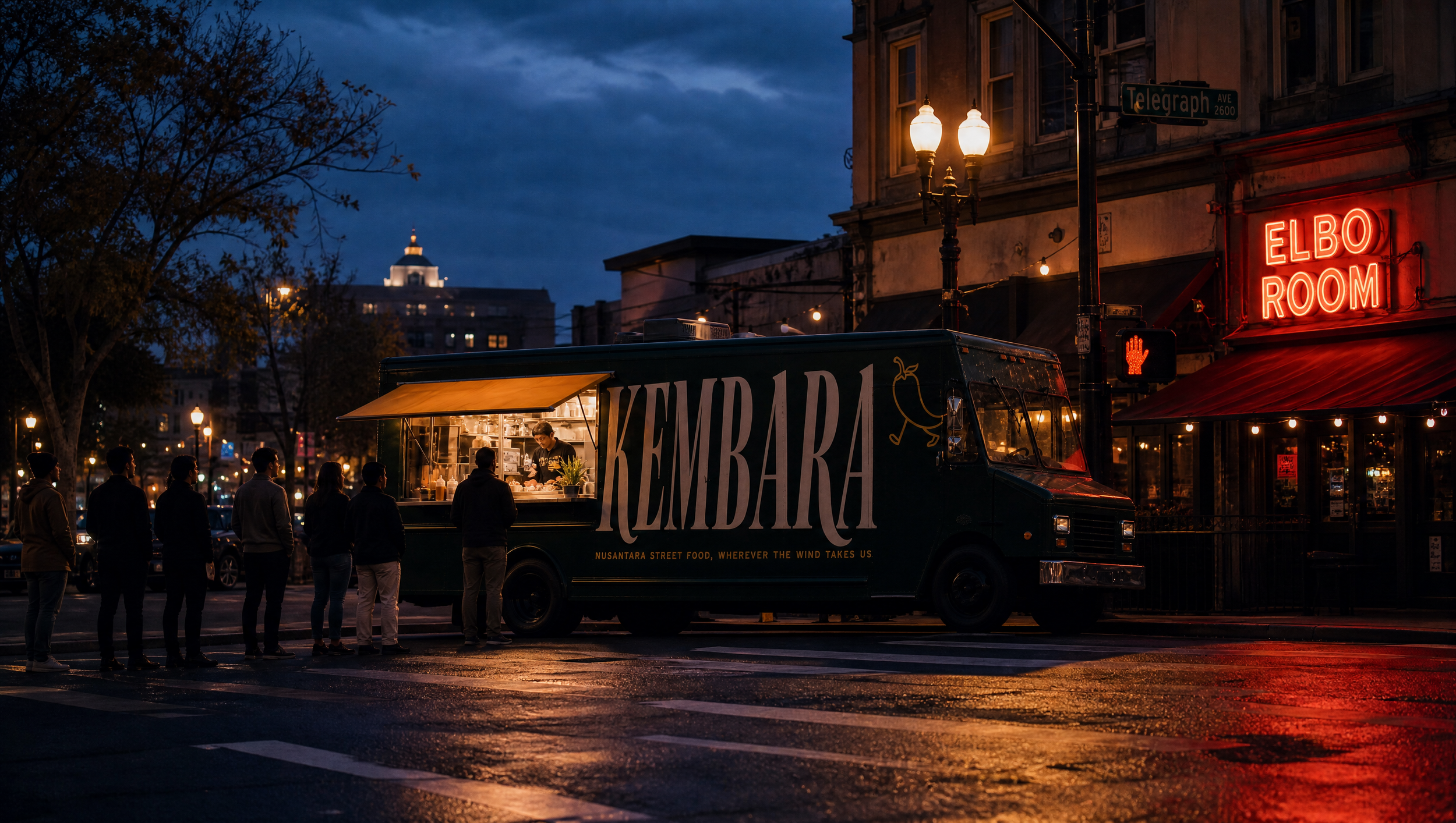
Truck Wrap
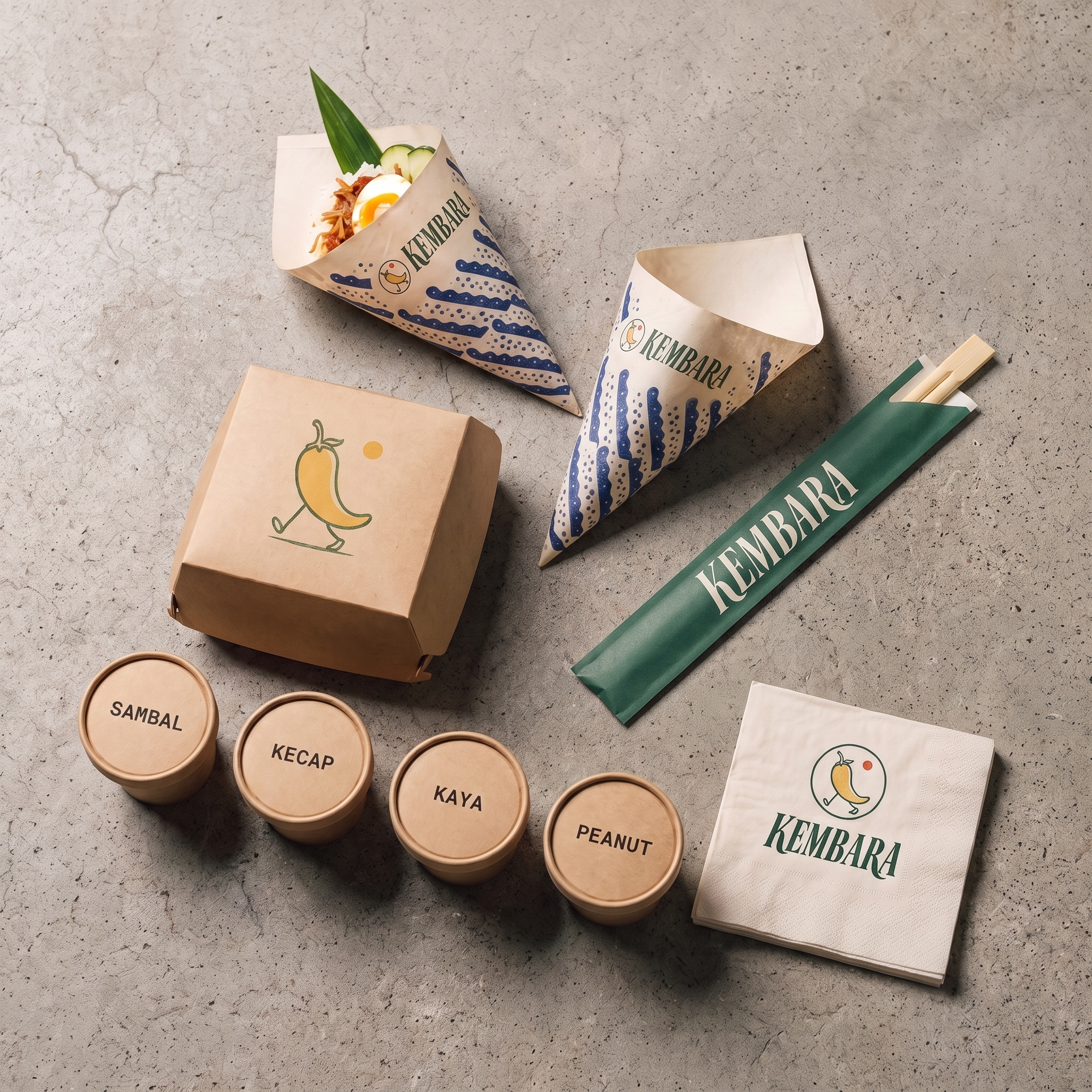
Package Design
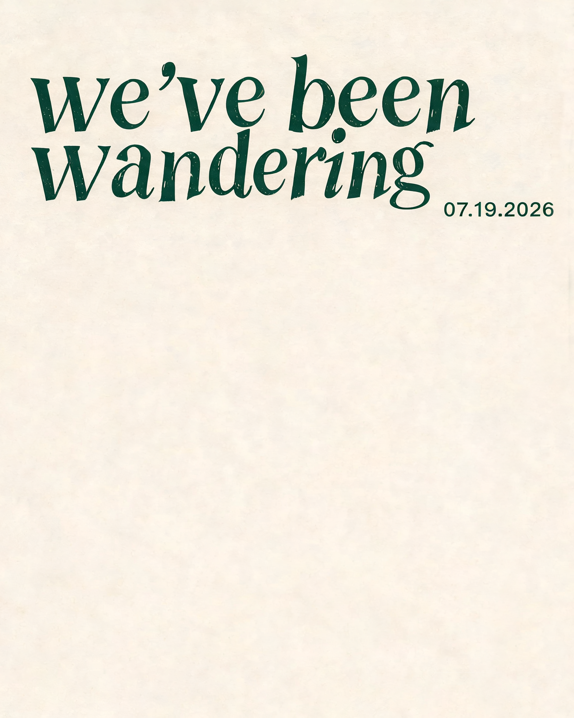
Billboard & Web Banner
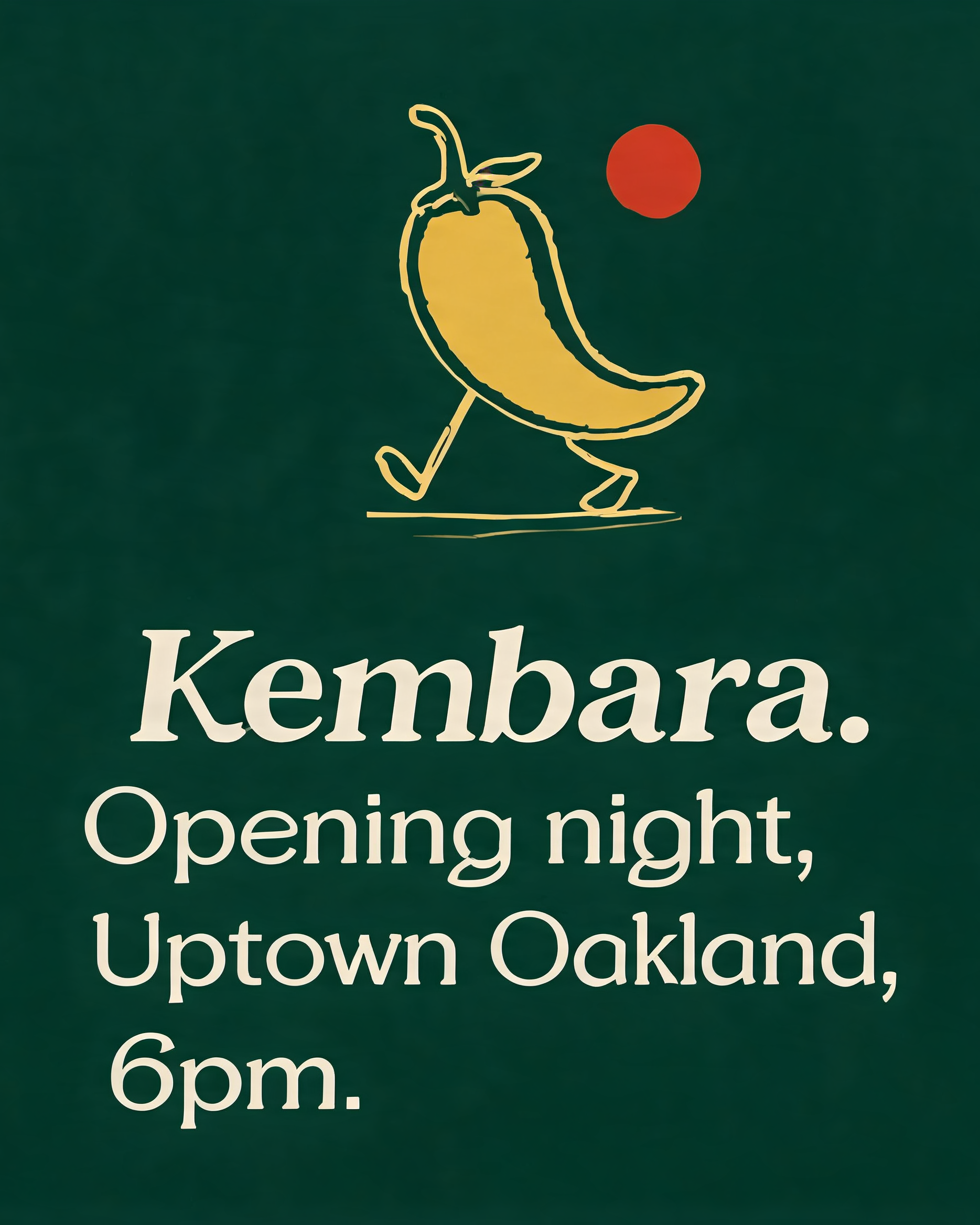
Social Media Posts
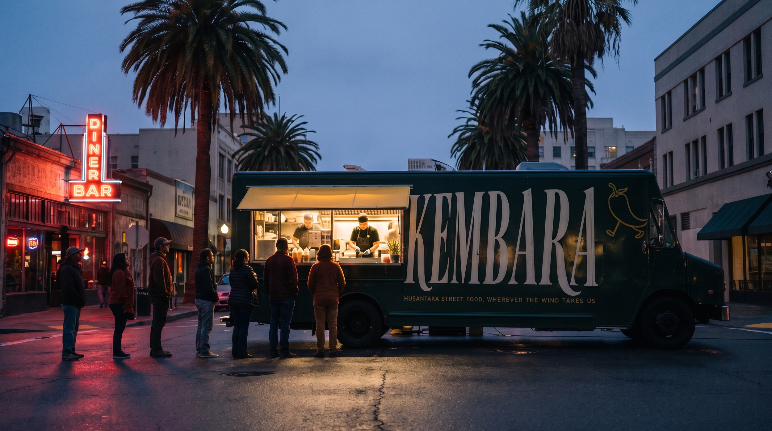
Editorial Photography
Restraint is what makes the color and pattern work read as intentional rather than decorative.
The Nordic-editorial discipline isn't an aesthetic borrowed for novelty; it's the scaffolding that lets a
genuinely maximalist palette stay legible at both truck-side and thumbnail scale.
That tension — control versus color, quiet versus loud — is the actual creative idea, and every deliverable in
this catalog exists to prove it holds up across formats.
Does it still feel like Kembara if you strip away the food photography?
Brand Guidelines
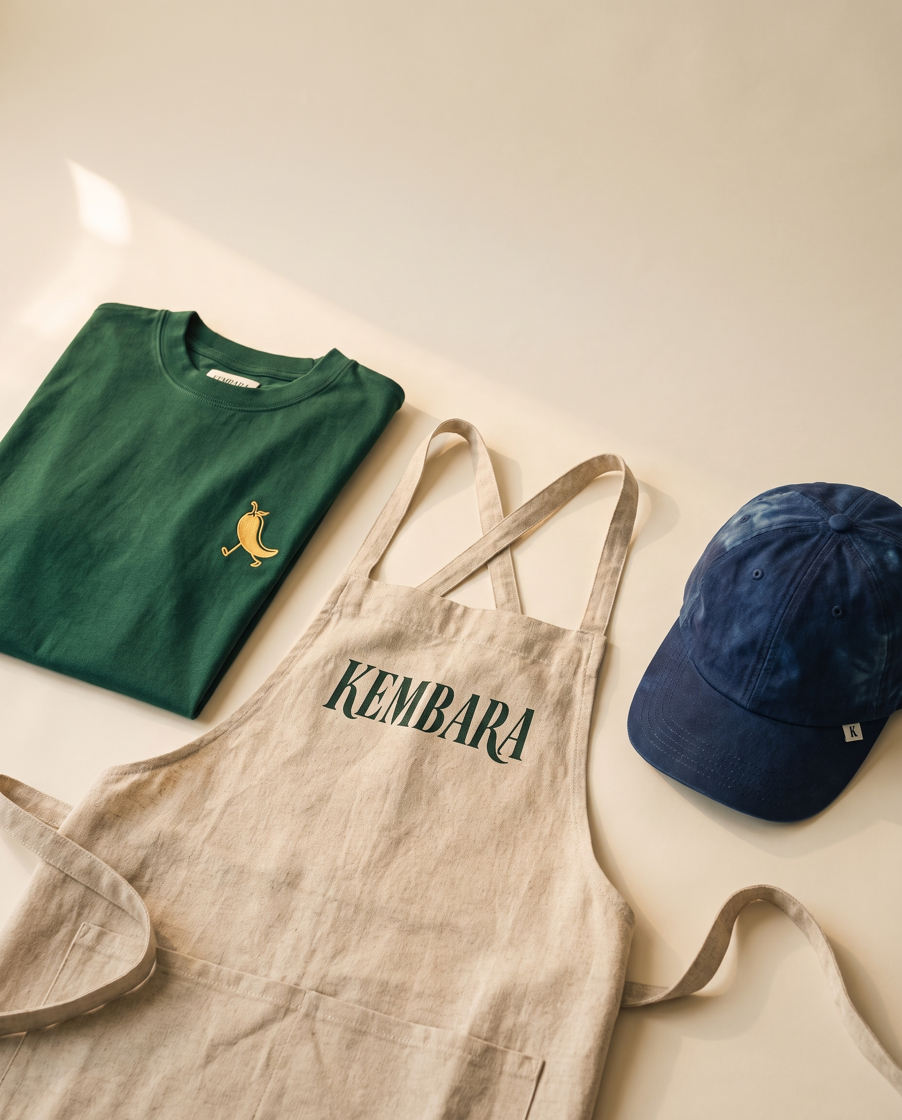
Staff & Customer Apparel
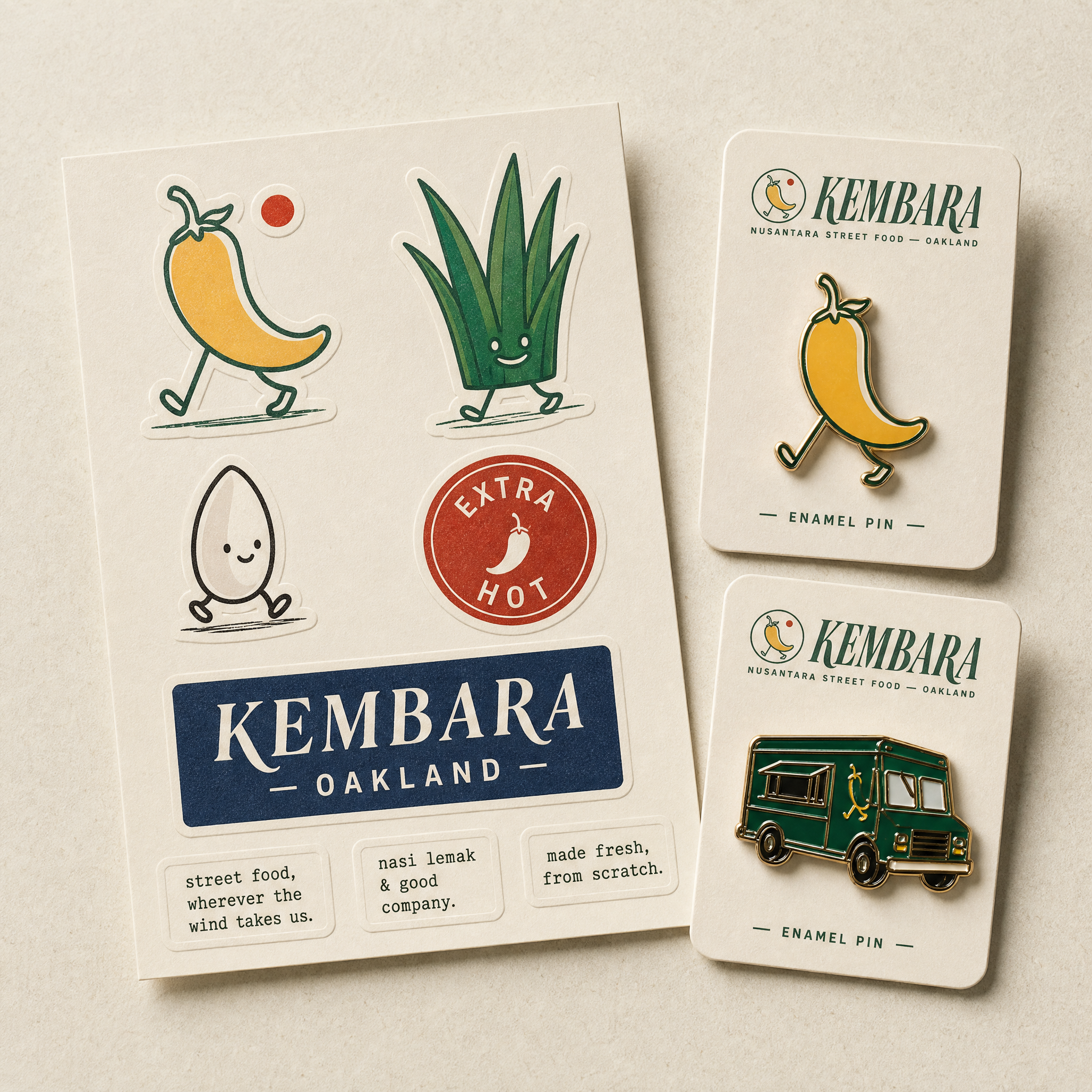
Branded Merchandise
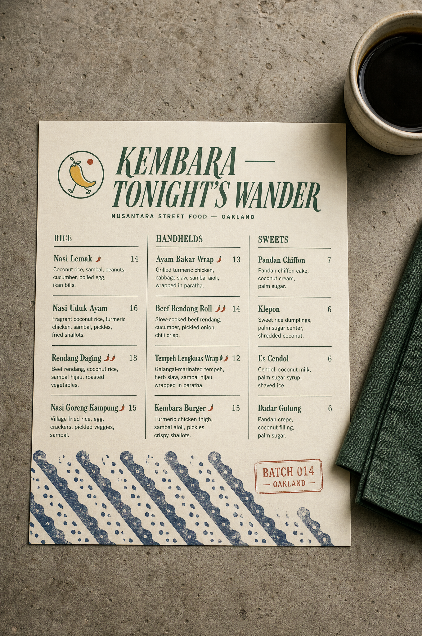
Menu
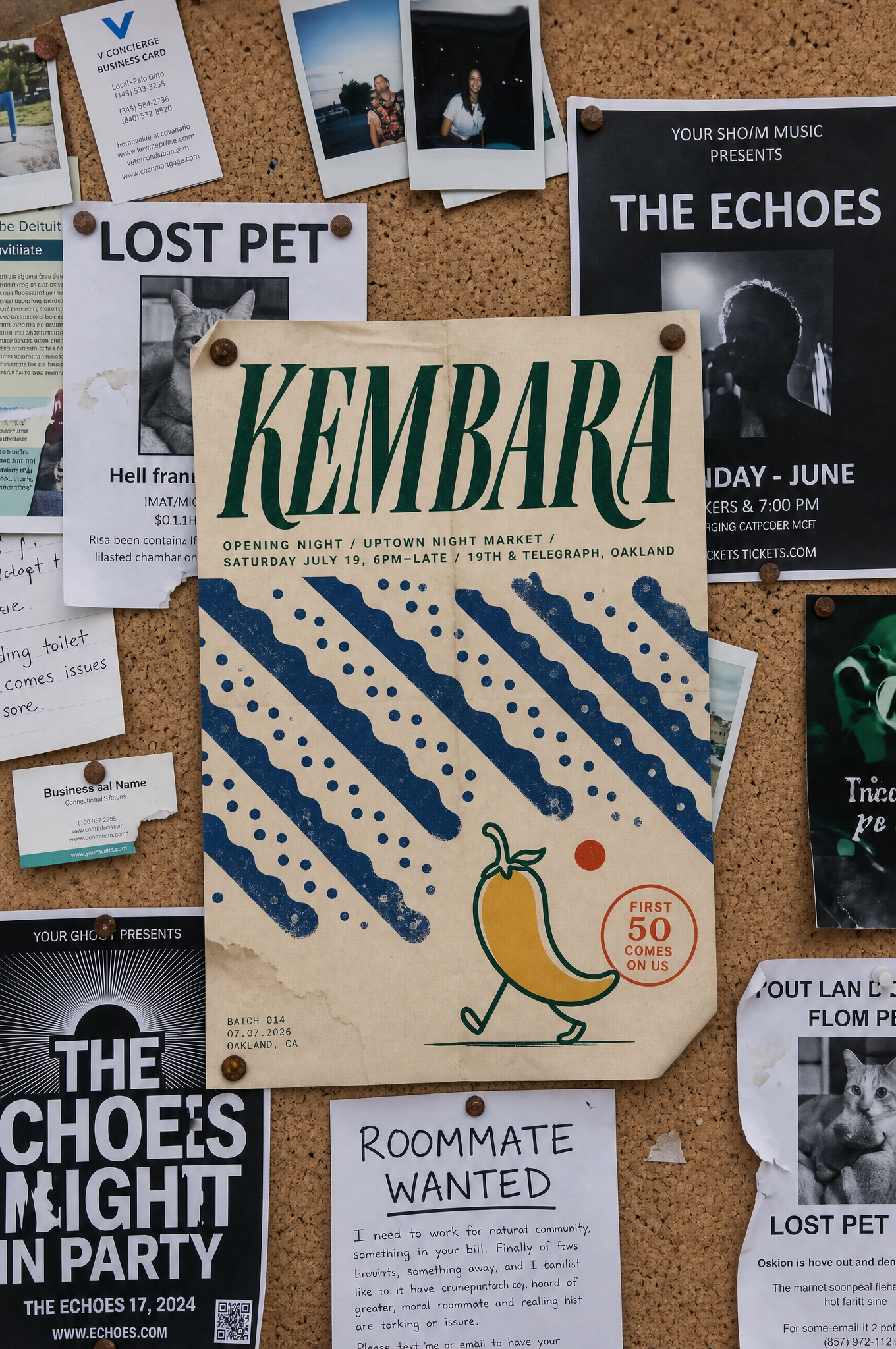
Poster Design
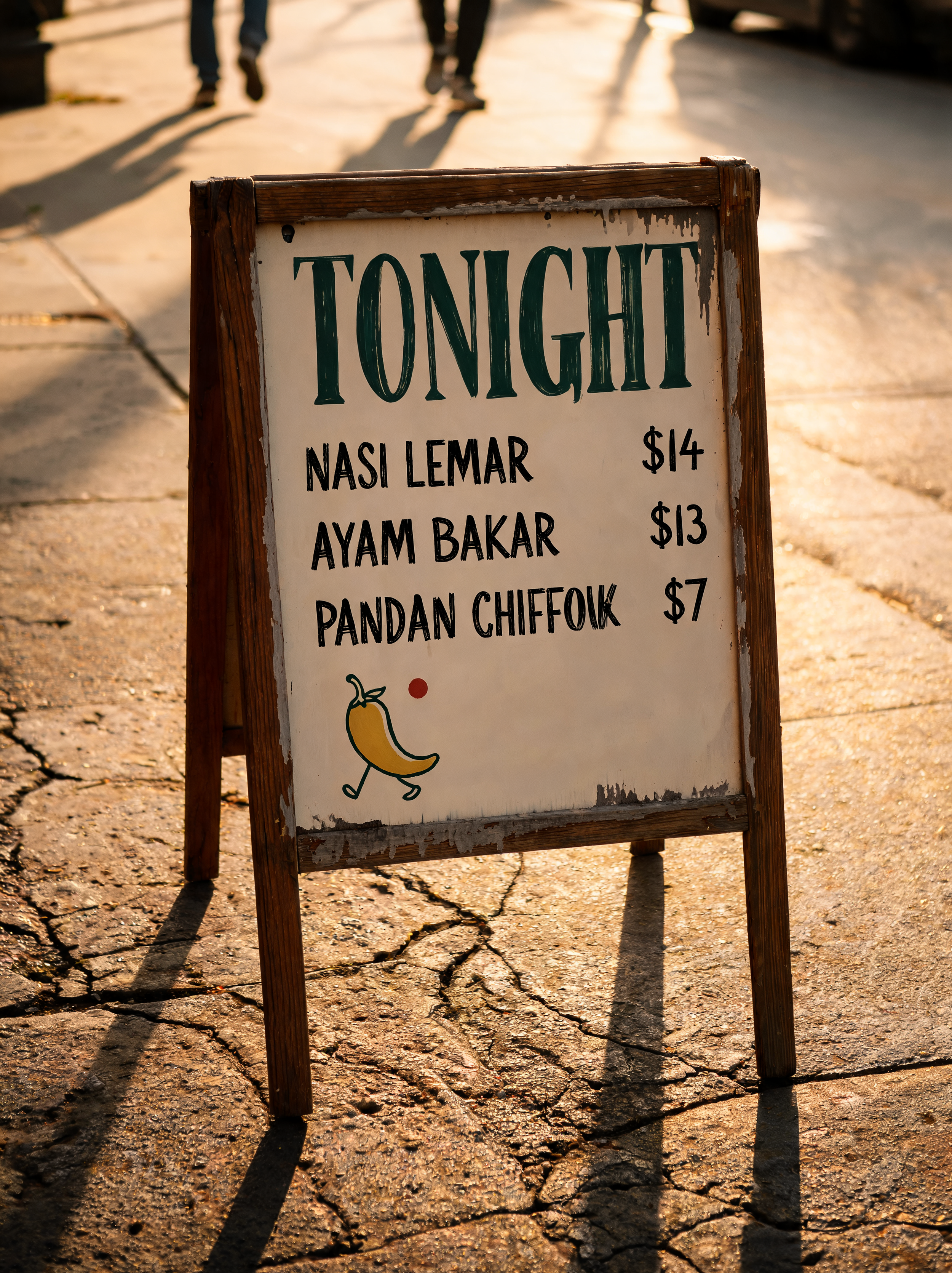
Sidewalk Sign
Teaser Video